McDonald’s Town House
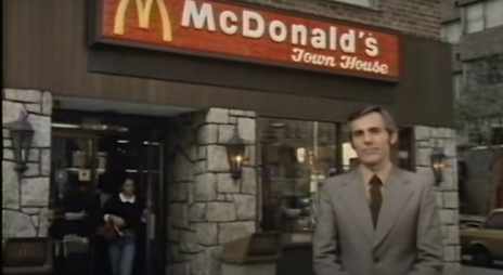
I liked this little video, the introduction of computers into McDonald’s, although I like the man with his order pad. And that Big Mac looks delicious, although I don’t know why the presenter plonked himself next to those other customers.
That Town House part of the logo is for when McDonald’s needed to identify the difference between their drive-thru and urban restaurants. I’d have thought that this was more apparent from a lack of drive-thru lane than part of the logo, but there we go. The words lingered on older signage until just a few years ago, but I think that they’ve all gone now.


