San Diego – San Diego Public Library
San Diego public library moved to its current location in 2013, in a building designed by local architect Rob Quigley, who can apparently see his building from his apartment. I visited this structure in January 2015, as part of a free tour organised by the library and I still consider this to be the best designed public library that I’ve visited anywhere in the world.
Unfortunately, the photos I took with my phone back in 2015 aren’t great, but they’re all that I’ve got to use, so they’ll have to do. Although I feel the need to return to San Diego, for many years my favourite city, so perhaps I’ll go back.
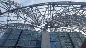
Huge efforts were made with the external design of the building, which cost $185 million, which is primarily just for the library, although there’s also a school housed here as well.
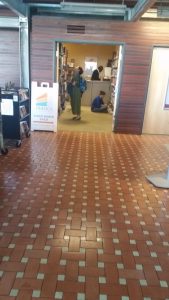
Whilst waiting for the tour, I had a little browse here, at the books for sale section, although I couldn’t easily carry any, so I desisted.
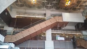
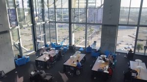
The interior of the library.
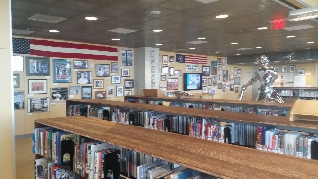
The baseball section of the library.
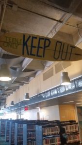
This is the area for teenagers, where adults are banned from (other than staff) to try and ensure that they felt it was an area just for them.
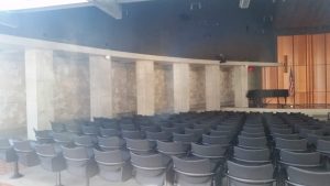
A lecture theatre area.
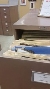
An old library cataloguing system, I think for press cuttings. I like that these things are kept in place, although technology might make them partly redundant, they can still be an inspiration to people.
There was lots of space to work, in areas that were quiet and with areas that had extensive views.
This was quite advanced at the time of my visit, a 3D printer.
Some of the things that had been designed on the printer.
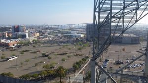
At the top of the building there’s a viewing gallery, with fine views over the local landscape, including the bridge to Coronado at the rear.
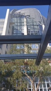
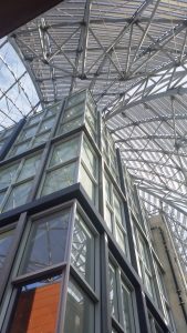
The view of the top of the building when standing on the viewing terrace.
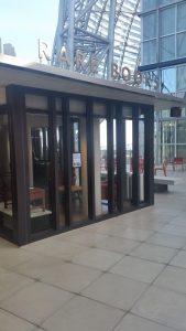
And the pinnacle of the building, the rare books section, an integral part of the design.
The tour was interesting and engaging, all free of charge to visitors, and it’s no surprise that the library is proud of their building. The council have taken a pretty negative approach to much of this, there’s a public ordinance voted on by local residents which demanded a greater public spend on libraries, but councillors have over-ridden it. When I visited, the library had seen a cut in its library funding, but a local backlash saw it returned back up to a higher level.
As a library, I found this impeccable. Modern, bright, proud of its traditions, spacious, exciting, well-designed and clearly an important part of their local community. Very lovely.

